Responsive Layout
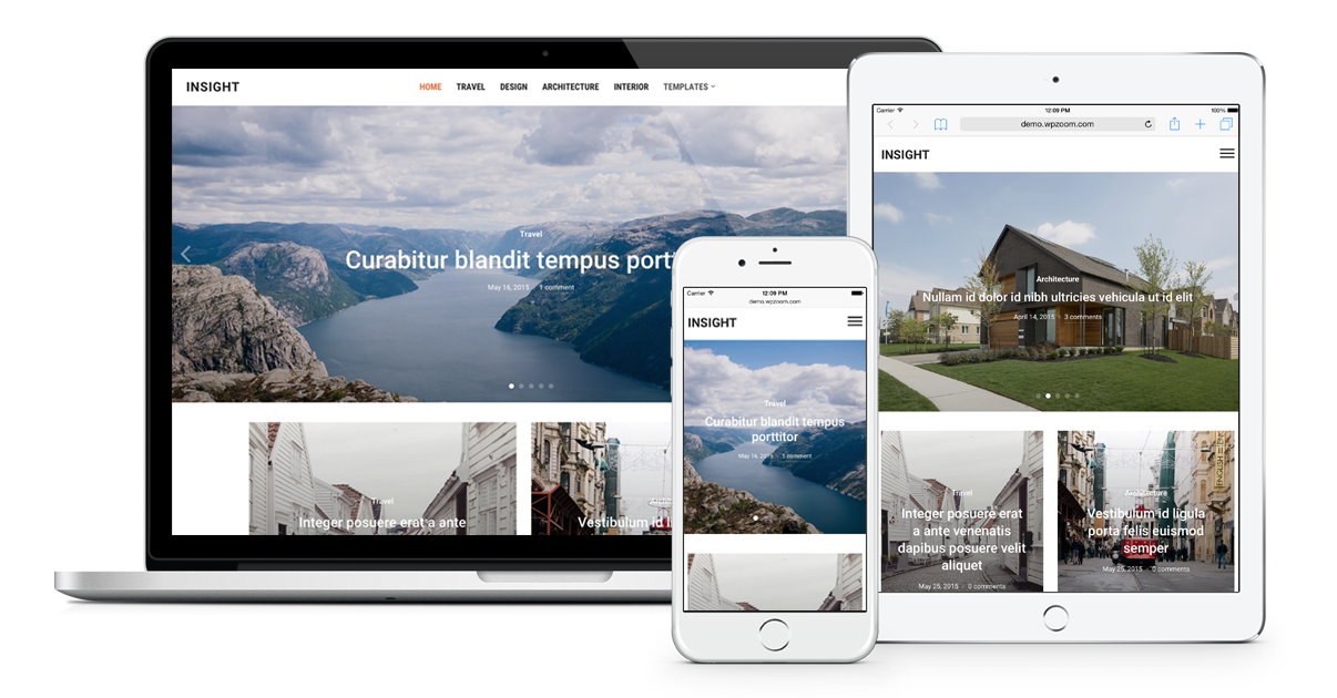
Insight boasts a fluid, responsive layout, so your articles will display perfectly across mobile and tablet devices. Images and galleries scale seamlessly when resizing the browser window. No matter what the resolution or screen size, every detail of your website will look perfect and professional.
Homepage Builder using Widgets
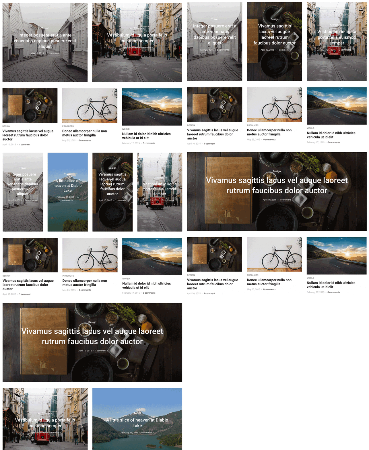
Build your homepage how you want it! Drag as many widgets as you want – including featured categories – and Insight will automatically place them in each widgetized area. You can also display posts full-width with the Featured Image as a background.
Use a Pre-defined Color Scheme or Create Your Own
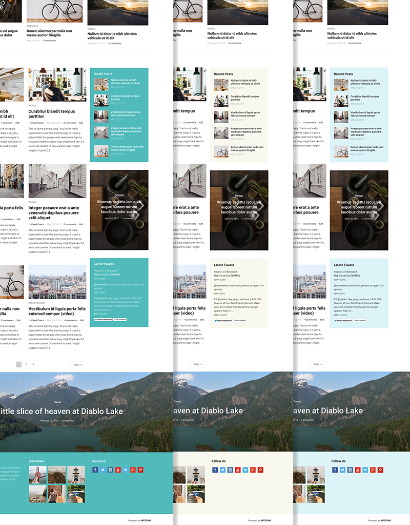
Insight comes with 3 pre-built color schemes, which you can quickly change from the Theme Options. None of those appeal? Just use the Live Customizer to get the colors you want.
Two Styles for Posts: Grid and List
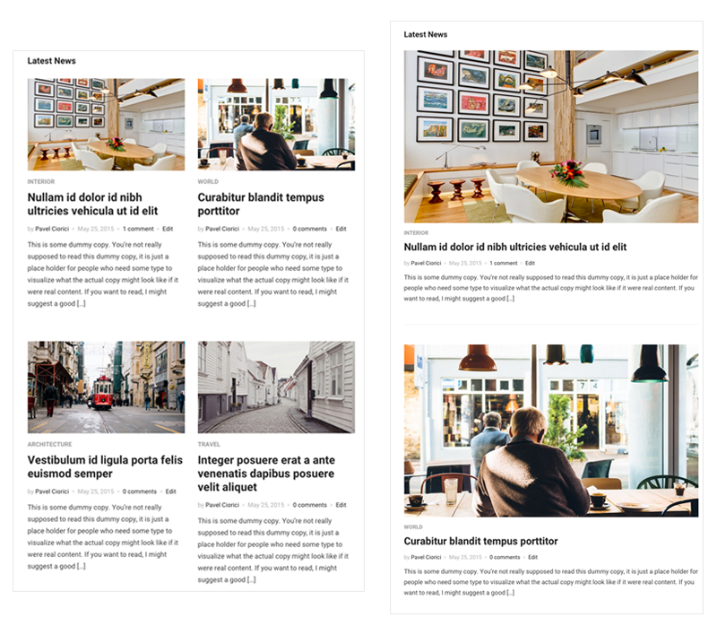
Display posts in a grid or go for a regular blog view with Featured Images on top of posts. Insight lets you choose your default post view.
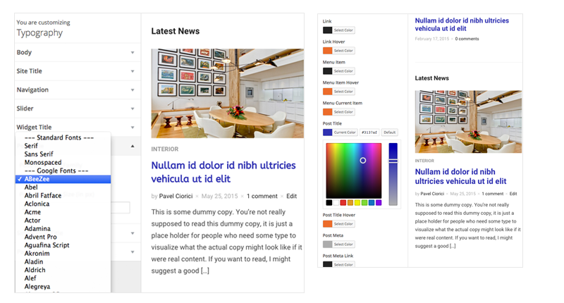
Live Customizer
The Live Customizer allows you to make changes to the theme and get an immediate preview. Customize Colors, Fonts, Background, Logo, Menu, Widgets and more, all with a live preview.
[button link=»http://wpzoom.com/themes/insight/» size=»large»]Get Insight now![/button]